Costume Design
Sarah Edwards does an exceptional job with the usage of costumes/outfits in the Secret Life Of Walter Mitty. Her usage of clothing nonverbally communicates the characters beliefs, culture and personality. In the hiking scene, she portrays what a New Yorker would wear hiking compared to a local indian. The local indians outfit has bright hand beaded necklases with a handmade beanie, compared to the $450 linen scarf that Walter has on.
The costumes also portray the significance of this treturous hike. Their hiking boots, jeans, heavy/active coat, glasses, and hiking back pack all communicate that they are in the mountains, hiking.
Walter wears a Ralph Lauren parka ($1,200) and linen scarf ($450) as he treks across the Himalayas. A customized leather wallet ($750) bears the inscription; “To see the world, things dangerous to come to, to see behind walls, to draw closer, to find each other and to feel, that is the purpose of life.”
How about the clothes? We love how they’re definitely stylish but don’t upstage things… and it’s hard to place them in time.
This is the handiwork of Sarah Edwards, our costume designer. We wanted the movie to exist in a timeless space, and the clothes contribute to this. As far as Walter’s clothes, he’s a creature of habit, and keeps it simple. It’s like he thought about his wardrobe one time, and created a utilitarian grouping of pieces… a uniform of his own devising that works, in a way, like a cloak of invisibility.
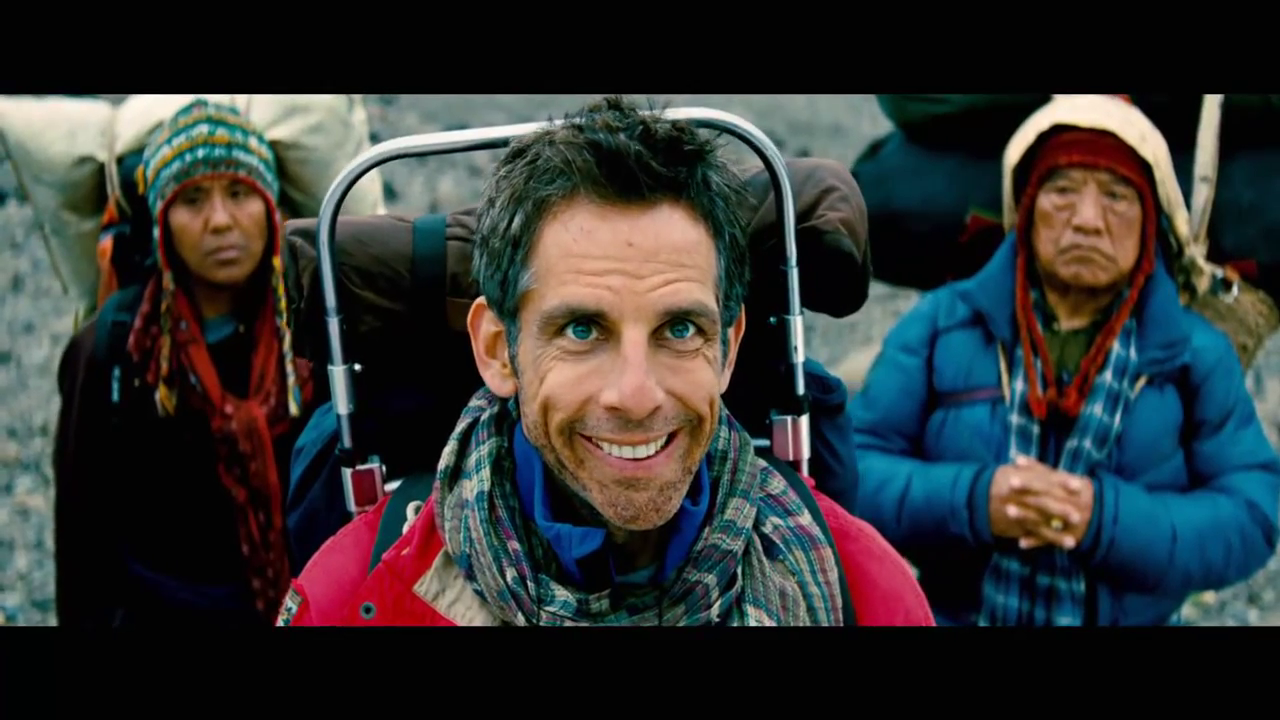
 Makeup Artist-Donald Kozma. The make up in the hike scene had to represent the climate and timeliness of the hike. Their facial hair had to become scruffy and fuller as the scene went on. The snow on the beard also had to be placed on his mustache and hair to nonverbally communicate that he is in freezing temperatures.
